事物 combogrid(combogrid)


Extend from $.fn.combo.defaults and $.fn.datagrid.defaults. Override defaults with $.fn.combogrid.defaults.
The combogrid combines a editable text box with drop-down datagrid panel, from which enables users to quickly find and select. The combogrid provides keyboard navigation support for selecting an item.
1. Create a combogrid from markup.
2. The combogrid can be created from existing <select> or <input> element using javascript.
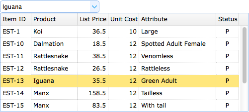
Let's add advanced auto-complete functionality to the combogrid. The drop-down datagrid will display the possible results according to the user types.
On server side, the 'q' parameter must be retrieve first. The user can query the database and then return an sql result in JSON format to the browser.
get_data.php:
| 字段摘要 | ||
|---|---|---|
String |
afterPageText
Show a label after the input component. |
|
String |
autoRowHeight
Defines if set the row height based on the contents of that row. Set to false can improve loading performance. |
|
String |
axis
Defines the axis which the dragged elements moves on, available value is 'v' or 'h', when set to null will move across 'v' and 'h' direction. |
|
String |
beforePageText
Show a label before the input component. |
|
String |
bodyCls
Add a CSS class to the panel body. |
|
String |
border
Defines if to show panel border. |
|
String |
cache
True to cache the panel content that loaded from href. |
|
String |
checkOnSelect
If true, the checkbox is checked/unchecked when the user clicks on a row. If false, the checkbox is only checked/unchecked when the user clicks exactly on the checkbox. |
|
String |
closable
Defines if to show closable button. |
|
String |
closed
Defines if the panel is closed at initialization. |
|
String |
cls
Add a CSS class to the panel. |
|
String |
collapsed
Defines if the panel is collapsed at initialization. |
|
String |
collapsible
Defines if to show collapsible button. |
|
String |
content
The panel body content. |
|
String |
cursor
The css cursor when dragging. |
|
String |
data
|
|
String |
delay
Delay to do searching from the last key input event. |
|
String |
deltaX
Tooltip offset in the X direction. This property is available since version 1.3.3. |
|
String |
deltaY
The dragged element position y corresponding to current cursor |
|
String |
disabled
Defines if to disable the field. |
|
String |
displayMsg
Display a page information. |
|
String |
doSize
If set to true,the panel will be resize and do layout when created. |
|
String |
edge
The drag width in which can start draggable. |
|
String |
editable
Defines if user can type text directly into the field. |
|
String |
editors
Defines the editor when editing a row. |
|
String |
fit
When true to set the panel size fit it's parent container. The example below shows a panel which can be auto resized to max inner dimensions of its parent container |
|
String |
fitColumns
True to auto expand/contract the size of the columns to fit the grid width and prevent horizontal scrolling. |
|
String |
generateDiv
是否先生成一个DIV。 |
|
String |
handle
The handle that start the draggable. |
|
String |
hasDownArrow
Defines if to display the down arrow button. |
|
String |
headerCls
Add a CSS class to the panel header. |
|
String |
height
The height of the component. This property is available since version 1.3.2. |
|
String |
href
|
|
String |
iconCls
A CSS class to display a 16x16 icon in panel. |
|
String |
id
对应的div的id属性值。 |
|
String |
idField
The id field name. |
|
String |
invalidMessage
ooltip text that appears when the content of text box is invalid. |
|
String |
label
|
|
String |
left
Set the panel left position. |
|
String |
loadMsg
The message displayed when datagrid load remote data. |
|
String |
loading
Defines if data is loading. |
|
String |
loadingMessage
When loading remote data show a message in the panel. |
|
String |
maximizable
Defines if to show maximizable button. |
|
String |
maximized
Defines if the panel is maximized at initialization. |
|
String |
method
The method type to request remote data. |
|
String |
minimizable
Defines if to show minimizable button. |
|
String |
minimized
Defines if the panel is minimized at initialization. |
|
String |
missingMessage
Tooltip text that appears when the content of text box is invalid. |
|
String |
mode
Defines how to load datagrid data when text changed. Set to 'remote' if the combogrid loads from server. When set to 'remote' mode, what the user types will be sent as the http request parameter named 'q' to server to retrieve the new data. |
|
String |
multiple
Defines if support multiple selection. |
|
String |
name
|
|
String |
noheader
If set to true, the panel header will not be created. |
|
String |
nowrap
True to display data in one line. Set to true can improve loading performance. |
|
String |
otherAttributes
一些其他属性,如: |
|
String |
pageList
When set pagination property, initialize the page size selecting list. |
|
String |
pageNumber
When set pagination property, initialize the page number. |
|
String |
pagePosition
Defines position of the pager bar. Available values are: 'top','bottom','both'. |
|
String |
pageSize
When set pagination property, initialize the page size. |
|
String |
pagination
True to show a pagination toolbar on datagrid bottom. |
|
String |
panelHeight
The drop down panel height. |
|
String |
panelWidth
The drop down panel width. |
|
String |
proxy
A proxy element to be used when dragging, when set to 'clone', a clone element is used as proxy. If a function is specified, it must return a jQuery object. |
|
String |
queryParams
When request remote data, sending additional parameters also. |
|
String |
readonly
Defines if the component is read-only. This property is available since version 1.3.3. |
|
String |
remoteSort
Defines if to sort data from server. |
|
String |
required
Defines if the field should be inputed. |
|
String |
resizeHandle
Resizing column position, Available value are: 'left','right','both'. When 'right', users can resize columns by dragging the right edge of column headers, etc. |
|
String |
revert
If set to true, the element will return to its start position when dragging stops. |
|
String |
rownumbers
True to show a row number column. |
|
String |
scrollbarSize
The scrollbar width(when scrollbar is vertical) or height(when scrollbar is horizontal). |
|
String |
selectOnCheck
If set to true, clicking a checkbox will always select the row. If false, selecting a row will not check the checkbox. |
|
String |
selectOnNavigation
Defines if to select an item when navigating items with keyboard. This property is available since version 1.3.3. |
|
String |
separator
The separator char for text when multiple selection. |
|
String |
showFooter
Defines if to show row footer. |
|
String |
showHeader
Defines if to show row header. |
|
String |
showPageList
Defines if to show page list. |
|
String |
showRefresh
Defines if to show refresh button. |
|
String |
singleSelect
True to allow selecting only one row. |
|
String |
sortName
Defines which column can be sorted. |
|
String |
sortOrder
Defines the column sort order, can only be 'asc' or 'desc'. |
|
String |
striped
True to stripe the rows. |
|
String |
style
html的style属性,如: |
|
String |
textField
The text field to be displayed in textbox. |
|
String |
tipPosition
|
|
String |
title
The title text to display in panel header. |
|
String |
toolbar
The top toolbar of datagrid panel. Possible values: |
|
String |
top
Set the panel top position. |
|
String |
total
The total records, which should be setted when pagination is created. |
|
String |
url
A URL to request data from remote site. |
|
String |
validType
Defines the field valid type, such as email, url, etc. Possible values are: |
|
String |
value
The default value. |
|
String |
view
Defines the view of datagrid. |
|
String |
width
The width of the component. |
|
| 方法摘要 | |
|---|---|
|
getClass
返回EsayUI的class名称,一般是easyui-draggable,其中draggable是事物名的小写。 |
|
getHtmlTag
|
|
toHtml
|
|
toJavaScriptCode
|
| 子事物摘要 | |
|---|---|
|
ExtJs
EXtjs组件。 |
|
FormLayout(表单布局)
表单布局使用Table布局,表单布局认为子事物都含有标签和输入,因此表单布局默认。 |
|
HtmlTag
可以自定义简单的HTML标签。 |
|
JavaScript
作用 |
|
XWRemoteSupport
提供打开窗口、打开TabItem等功能。 |
|
button(按钮)
|
|
buttons
Defines customize buttons, each button contains two properties: |
|
checkBox(复选框)
|
|
code(代码)
可以直接编辑HTML的地方。 |
|
columns
The datagrid columns config object, see column properties for more details. |
|
comboBox(下拉框)
|
|
dateInput(日期输入)
|
|
diagram(图表)
|
|
div
简单的div标签。 |
|
extractor
Defines how to extract the content from ajax response, return extracted data. |
|
filter
Defines how to select the local data when 'mode' is set to 'local'. Return true to select the row. |
|
form(表单)
|
|
frozenColumns
Same as the columns property, but the these columns will be frozen on left. |
|
grid(数据格)
|
|
hidden(隐藏输入)
隐藏字段。 |
|
htmlCode(HTML代码)
通过XWorker内置的HTML编辑器编写HTML代码。 |
|
keyHandler
|
|
label(标签)
|
|
list(列表)
|
|
loadFilter
Return the filtered data to display. The function take one parameter 'data' that indicate the original data. You can change original source data to standard data format. This function must return standard data object that contain 'total' and 'rows' properties. |
|
loader
Defines how to load data from remote server. Return false can abort this action. This function takes following parameters: |
|
menu(菜单)
|
|
onAfterEdit
Fires when user finish editing, the parameters contains: |
|
onBeforeClose
Fires before panel is closed, return false to cancel the close. The panel declared below cannot be closed. |
|
onBeforeCollapse
Fires before panel is collapsed, return false to stop the collapse. |
|
onBeforeDestroy
Fires before panel is destroyed, return false to cancel the destroy. |
|
onBeforeDrag
Fires before dragging, return false to cancel this dragging. |
|
onBeforeEdit
Fires when user start editing a row, the parameters contains: |
|
onBeforeExpand
Fires before panel is expanded, return false to stop the expand. |
|
onBeforeLoad
Fires before a request is made to load data. If return false the load action will be canceled. |
|
onBeforeOpen
Fires before panel is opened, return false to stop the open. |
|
onBeforeRefresh
Fires before the refresh button is clicked, return false to cancel the refresh action. |
|
onCancelEdit
Fires when user cancel editing a row, the parameters contains: |
|
onChange
Fires when the field value is changed. |
|
onChangePageSize
Fires when user change the page size. |
|
onCheck
Fires when user check a row, the parameters contains: |
|
onCheckAll
Fires when user check all rows. This event is available since version 1.3. |
|
onClickCell
Fires when user click a cell. |
|
onClickRow
Fires when user click a row, the parameters contains: |
|
onClose
Fires after panel is closed. |
|
onCollapse
Fires after panel is collpased. |
|
onDblClickCell
Fires when user dblclick a cell. |
|
onDblClickRow
Fires when user dblclick a row, the parameters contains: |
|
onDestroy
Fires after panel is destroyed. |
|
onDrag
Fires during dragging. Return false will not do dragging actually. |
|
onExpand
Fires after panel is expanded. |
|
onHeaderContextMenu
Fires when the header of datagrid is right clicked. |
|
onHidePanel
Fires when drop down panel hide. |
|
onLoad
Fires when remote data is loaded. |
|
onLoadError
Fires when some error occur to load remote data. |
|
onLoadSuccess
Fires when data is loaded successfully. |
|
onMaximize
Fires after the window has been maximized. |
|
onMinimize
Fires after the window has been minimized. |
|
onMove
Fires after panel is moved. |
|
onOpen
Fires after panel is opened. |
|
onRefresh
Fires after refresh. |
|
onResize
Fires after panel is resized. |
|
onResizeColumn
Fires when user resize the column. |
|
onRestore
Fires after the window has been restored to its original size. |
|
onRowContextMenu
Fires when a row is right clicked. |
|
onSelect
Fires when user select a row, the parameters contains: |
|
onSelectAll
Fires when user select all rows. |
|
onSelectPage
Fires when user select a new page. callback function contains two parameter: |
|
onShowPanel
Fires when drop down panel show. |
|
onSortColumn
Fires when user sort a column, the parameters contains: |
|
onStartDrag
Fires when the target object start dragging. |
|
onStopDrag
Fires when the dragging stops. |
|
onUncheck
Fires when user uncheck a row, the parameters contains: |
|
onUncheckAll
Fires when user uncheck all rows. This event is available since version 1.3. |
|
onUnselect
Fires when user unselect a row, the parameters contains: |
|
onUnselectAll
Fires when user unselect all rows. |
|
password(密码框)
|
|
proxy
A proxy element to be used when dragging, when set to 'clone', a clone element is used as proxy. If a function is specified, it must return a jQuery object. |
|
radioButton(选项按钮)
|
|
rowStyler
Return style such as 'background:red'. The function take two parameter: |
|
span
简单的span标签。 |
|
table(表格)
|
|
textArea(文本区)
|
|
textField(文本框)
|
|
toolbar
|
|
tools
Custom tools, possible values: |
|
yui-ext
|
| 字段详细信息 |
|---|
Show a label after the input component.
Defines if set the row height based on the contents of that row. Set to false can improve loading performance.
Defines the axis which the dragged elements moves on, available value is 'v' or 'h', when set to null will move across 'v' and 'h' direction.
Show a label before the input component.
Add a CSS class to the panel body.
Defines if to show panel border.
True to cache the panel content that loaded from href.
If true, the checkbox is checked/unchecked when the user clicks on a row. If false, the checkbox is only checked/unchecked when the user clicks exactly on the checkbox.
This property is available since version 1.3.
Defines if to show closable button.
Defines if the panel is closed at initialization.
Add a CSS class to the panel.
Defines if the panel is collapsed at initialization.
Defines if to show collapsible button.
The panel body content.
The css cursor when dragging.
Delay to do searching from the last key input event.
Tooltip offset in the X direction. This property is available since version 1.3.3.
The dragged element position y corresponding to current cursor
Defines if to disable the field.
Display a page information.
If set to true,the panel will be resize and do layout when created.
The drag width in which can start draggable.
Defines if user can type text directly into the field.
Defines the editor when editing a row.
When true to set the panel size fit it's parent container. The example below shows a panel which can be auto resized to max inner dimensions of its parent container
<div style="width:200px;height:100px;padding:5px">
	<div class="easyui-panel" style="width:200px;height:100px"
			data-options="fit:true,border:false">
		Embedded Panel
	</div>
</div>
True to auto expand/contract the size of the columns to fit the grid width and prevent horizontal scrolling.
是否先生成一个DIV。
The handle that start the draggable.
Defines if to display the down arrow button.
Add a CSS class to the panel header.
The height of the component. This property is available since version 1.3.2.
A CSS class to display a 16x16 icon in panel.
对应的div的id属性值。
The id field name.
ooltip text that appears when the content of text box is invalid.
Set the panel left position.
The message displayed when datagrid load remote data.
Defines if data is loading.
When loading remote data show a message in the panel.
Defines if to show maximizable button.
Defines if the panel is maximized at initialization.
The method type to request remote data.
Defines if to show minimizable button.
Defines if the panel is minimized at initialization.
Tooltip text that appears when the content of text box is invalid.
Defines how to load datagrid data when text changed. Set to 'remote' if the combogrid loads from server. When set to 'remote' mode, what the user types will be sent as the http request parameter named 'q' to server to retrieve the new data.
Defines if support multiple selection.
If set to true, the panel header will not be created.
True to display data in one line. Set to true can improve loading performance.
一些其他属性,如:
onClick="javascript:void(0)" align="left"
When set pagination property, initialize the page size selecting list.
When set pagination property, initialize the page number.
Defines position of the pager bar. Available values are: 'top','bottom','both'.
This property is available since version 1.3.
When set pagination property, initialize the page size.
True to show a pagination toolbar on datagrid bottom.
The drop down panel height.
The drop down panel width.
A proxy element to be used when dragging, when set to 'clone', a clone element is used as proxy. If a function is specified, it must return a jQuery object.
The example below shows how to create a simple proxy object.
$('.dragitem').draggable({
	proxy: function(source){
		var p = $('<div style="border:1px solid #ccc;width:80px"></div>');
		p.html($(source).html()).appendTo('body');
		return p;
	}
});
When request remote data, sending additional parameters also.
Code example:
$('#dg').datagrid({
	queryParams: {
		name: 'easyui',
		subject: 'datagrid'
	}
});
Defines if the component is read-only. This property is available since version 1.3.3.
Defines if to sort data from server.
Defines if the field should be inputed.
Resizing column position, Available value are: 'left','right','both'. When 'right', users can resize columns by dragging the right edge of column headers, etc.
This property is available since version 1.3.2.
If set to true, the element will return to its start position when dragging stops.
True to show a row number column.
The scrollbar width(when scrollbar is vertical) or height(when scrollbar is horizontal).
If set to true, clicking a checkbox will always select the row. If false, selecting a row will not check the checkbox.
This property is available since version 1.3.
Defines if to select an item when navigating items with keyboard. This property is available since version 1.3.3.
The separator char for text when multiple selection.
Defines if to show row footer.
Defines if to show row header.
Defines if to show page list.
Defines if to show refresh button.
True to allow selecting only one row.
Defines which column can be sorted.
Defines the column sort order, can only be 'asc' or 'desc'.
True to stripe the rows.
html的style属性,如:
width:100px;height:100px;
The text field to be displayed in textbox.
| Defines the position of tip message when the content of text box is invalid. Possible values: 'left','right'. This property is available since version 1.3.2. |
The title text to display in panel header.
The top toolbar of datagrid panel. Possible values:
1) an array, each tool options are same as linkbutton.
2) a selector that indicate the toolbar.
Define toolbar within a <div> tag:
$('#dg').datagrid({
	toolbar: '#tb'
});
<div id="tb">
<a href="#" class="easyui-linkbutton" data-options="iconCls:'icon-edit',plain:true"/a>
<a href="#" class="easyui-linkbutton" data-options="iconCls:'icon-help',plain:true"/a>
</div>
Define toolbar via array:
$('#dg').datagrid({
	toolbar: [{
		iconCls: 'icon-edit',
		handler: function(){alert('edit')}
	},'-',{
		iconCls: 'icon-help',
		handler: function(){alert('help')}
	}]
});
Set the panel top position.
The total records, which should be setted when pagination is created.
A URL to request data from remote site.
Defines the field valid type, such as email, url, etc. Possible values are:
1) a valid type string, apply a single validate rule.
2) an valid type array, apply multiple validate rules. The multiple validate rules on a field are available since version 1.3.2.
Code example:
<input class="easyui-validatebox" data-options="required:true,validType:'url'">
<input class="easyui-validatebox" data-options="
	required:true,
	validType:['email','length[0,20]']
">
The default value.
Defines the view of datagrid.
The width of the component.
| 方法详细信息 |
|---|
返回EsayUI的class名称,一般是easyui-draggable,其中draggable是事物名的小写。
| 子事物详细信息 |
|---|
EXtjs组件。
表单布局使用Table布局,表单布局认为子事物都含有标签和输入,因此表单布局默认。
可以自定义简单的HTML标签。
作用
用于生成JavaScript代码片段,所有能够生成JavaScript代码片段的都应注册到此子事物下。
JavaScript注册
所有能够生成 JavaScript代码的事物都应该注册到本事物下。
重载toHtml方法
如果一个事物继承了JavaScript并且只是用于生成JavaScript代码的,那么应该重载toHtml方法,返回在toHtml方法里返回null,可以使用NOOP动作。
提供打开窗口、打开TabItem等功能。
Defines customize buttons, each button contains two properties:
iconCls: the CSS class which will show a background image
handler: a handler function when button is clicked
The customize buttons can be declared from markup:
<div class="easyui-pagination" style="border:1px solid #ccc" data-options="
		total: 114,
		buttons: [{
			iconCls:'icon-add',
			handler:function(){alert('add')}
		},'-',{
			iconCls:'icon-save',
			handler:function(){alert('save')}
		}]">
</div>
The customize buttons can also be created using javascript:
$('#pp').pagination({
	total: 114,
	buttons: [{
		iconCls:'icon-add',
		handler:function(){alert('add')}
	},'-',{
		iconCls:'icon-save',
		handler:function(){alert('save')}
	}]
});
可以直接编辑HTML的地方。
The datagrid columns config object, see column properties for more details.
简单的div标签。
Defines how to extract the content from ajax response, return extracted data.
extractor: function(data){
	var pattern = /<body[^>]*>((.|[\n\r])*)<\/body>/im;
	var matches = pattern.exec(data);
	if (matches){
		return matches[1];	// only extract body content
	} else {
		return data;
	}
}
Defines how to select the local data when 'mode' is set to 'local'. Return true to select the row.
Code example:
$('#cc').combogrid({
	filter: function(q, row){
		var opts = $(this).combogrid('options');
		return row[opts.textField].indexOf(q) == 0;
	}
});
Same as the columns property, but the these columns will be frozen on left.
通过XWorker内置的HTML编辑器编写HTML代码。
Return the filtered data to display. The function take one parameter 'data' that indicate the original data. You can change original source data to standard data format. This function must return standard data object that contain 'total' and 'rows' properties.
Code example:
// removing 'd' object from asp.net web service json output
$('#dg').datagrid({
	loadFilter: function(data){
		if (data.d){
			return data.d;
		} else {
			return data;
		}
	}
});
Defines how to load data from remote server. Return false can abort this action. This function takes following parameters:
param: the parameter object to pass to remote server.
success(data): the callback function that will be called when retrieve data successfully.
error(): the callback function that will be called when failed to retrieve data.
Fires when user finish editing, the parameters contains:
rowIndex: the editing row index, start with 0
rowData: the record corresponding to the editing row
changes: the changed field/value pairs
Fires before panel is closed, return false to cancel the close. The panel declared below cannot be closed.
<div class="easyui-panel" style="width:300px;height:200px;"
		title="My Panel" data-options="onBeforeClose:function(){return false}">
	The panel cannot be closed.
</div>
Fires before panel is collapsed, return false to stop the collapse.
Fires before panel is destroyed, return false to cancel the destroy.
Fires before dragging, return false to cancel this dragging.
Fires when user start editing a row, the parameters contains:
rowIndex: the editing row index, start with 0
rowData: the record corresponding to the editing row
Fires before panel is expanded, return false to stop the expand.
Fires before a request is made to load data. If return false the load action will be canceled.
Fires before panel is opened, return false to stop the open.
Fires before the refresh button is clicked, return false to cancel the refresh action.
Fires when user cancel editing a row, the parameters contains:
rowIndex: the editing row index, start with 0
rowData: the record corresponding to the editing row
Fires when the field value is changed.
Fires when user change the page size.
Fires when user check a row, the parameters contains:
rowIndex: the checked row index, start with 0
rowData: the record corresponding to the checked row
This event is available since version 1.3.
Fires when user check all rows. This event is available since version 1.3.
Fires when user click a cell.
Fires when user click a row, the parameters contains:
rowIndex: the clicked row index, start with 0
rowData: the record corresponding to the clicked row
Fires after panel is closed.
Fires after panel is collpased.
Fires when user dblclick a cell.
Code example:
// when double click a cell, begin editing and make the editor get focus
$('#dg').datagrid({
	onDblClickCell: function(index,field,value){
		$(this).datagrid('beginEdit', index);
		var ed = $(this).datagrid('getEditor', {index:index,field:field});
		$(ed.target).focus();
	}
});
Fires when user dblclick a row, the parameters contains:
rowIndex: the clicked row index, start with 0
rowData: the record corresponding to the clicked row
Fires after panel is destroyed.
Fires during dragging. Return false will not do dragging actually.
Fires after panel is expanded.
Fires when the header of datagrid is right clicked.
Fires when drop down panel hide.
Fires when remote data is loaded.
Fires when some error occur to load remote data.
Fires when data is loaded successfully.
Fires after the window has been maximized.
Fires after the window has been minimized.
Fires after panel is moved.
left: the new left postion
top: the new top position
Fires after panel is opened.
Fires after refresh.
Fires after panel is resized.
width: the new outer width
height: the new outer height
Fires when user resize the column.
Fires after the window has been restored to its original size.
Fires when a row is right clicked.
Fires when user select a row, the parameters contains:
rowIndex: the selected row index, start with 0
rowData: the record corresponding to the selected row
Fires when user select all rows.
Fires when user select a new page. callback function contains two parameter:
pageNumber: the new page number
pageSize: the new page size
Code example:
$('#pp').pagination({
	onSelectPage:function(pageNumber, pageSize){
		$(this).pagination('loading');
		alert('pageNumber:'+pageNumber+',pageSize:'+pageSize);
		$(this).pagination('loaded');
	}
});
Fires when drop down panel show.
Fires when user sort a column, the parameters contains:
sort: the sort column field name
order: the sort column order
Fires when the target object start dragging.
Fires when the dragging stops.
Fires when user uncheck a row, the parameters contains:
rowIndex: the unchecked row index, start with 0
rowData: the record corresponding to the unchecked row
This event is available since version 1.3.
Fires when user uncheck all rows. This event is available since version 1.3.
Fires when user unselect a row, the parameters contains:
rowIndex: the unselected row index, start with 0
rowData: the record corresponding to the unselected row
Fires when user unselect all rows.
A proxy element to be used when dragging, when set to 'clone', a clone element is used as proxy. If a function is specified, it must return a jQuery object.
The example below shows how to create a simple proxy object.
$('.dragitem').draggable({
	proxy: function(source){
		var p = $('<div style="border:1px solid #ccc;width:80px"></div>');
		p.html($(source).html()).appendTo('body');
		return p;
	}
});
Return style such as 'background:red'. The function take two parameter:
rowIndex: the row index, start with 0
rowData: the record corresponding to this row
Code example:
$('#dg').datagrid({
	rowStyler: function(index,row){
		if (row.listprice>80){
			return 'background-color:#6293BB;color:#fff;';
		}
	}
});
简单的span标签。
Custom tools, possible values:
1) an array, each element contains iconCls and handler properties.
2) a selector that indicating the tools
The panel tools can be declared with exists <div> tag:
<div class="easyui-panel" style="width:300px;height:200px"
		title="My Panel" data-options="iconCls:'icon-ok',tools:'#tt'">
</div>
<div id="tt">
	<a href="#" class="icon-add" onclick="javascript:alert('add')"></a>
	<a href="#" class="icon-edit" onclick="javascript:alert('edit')"></a>
</div>
The panel tools can also be defined via array:
<div class="easyui-panel" style="width:300px;height:200px"
		title="My Panel" data-options="iconCls:'icon-ok',tools:[
				{
					iconCls:'icon-add',
					handler:function(){alert('add')}
				},{
					iconCls:'icon-edit',
					handler:function(){alert('edit')}
				}]">
</div>