事物 tabs(tabs)


Override defaults with $.fn.tabs.defaults.
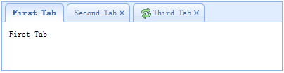
The tabs display a collection of panel. It shows only one tab panel at a time. Each tab panel has the header title and some mini button tools, including close button and other customized buttons.
1. Create tabs via markup
Create tabs from markup is even easier, we don't need to write any JavaScript code. Remember to add 'easyui-tabs' class to <div/> markup. Each tab panel is created via sub <div/> markup, the usage is same as panel.
2. Create tabs programatically
Now we create tabs programatically, we catch the 'onSelect' event also.
Add a new tab panel with mini tools, the mini tools icon(8x8) is placed before the close button.
| 字段摘要 | |
|---|---|
String |
bodyCls
Add a CSS class to the panel body. |
String |
border
True to show tabs container border. |
String |
cache
True to cache the panel content that loaded from href. |
String |
closable
Defines if to show closable button. |
String |
closed
Defines if the panel is closed at initialization. |
String |
cls
Add a CSS class to the panel. |
String |
collapsed
Defines if the panel is collapsed at initialization. |
String |
collapsible
Defines if to show collapsible button. |
String |
content
The panel body content. |
String |
doSize
If set to true,the panel will be resize and do layout when created. |
String |
fit
True to set the size of tabs container to fit it's parent container. |
String |
generateDiv
是否先生成一个DIV。 |
String |
headerCls
Add a CSS class to the panel header. |
String |
headerWidth
The tab header width, it is valid only when tabPosition is set to 'left' or 'right'. This property is available since version 1.3.2. |
String |
height
The height of tabs container. |
String |
href
|
String |
iconCls
A CSS class to display a 16x16 icon in panel. |
String |
id
对应的div的id属性值。 |
String |
label
|
String |
left
Set the panel left position. |
String |
loadingMessage
When loading remote data show a message in the panel. |
String |
maximizable
Defines if to show maximizable button. |
String |
maximized
Defines if the panel is maximized at initialization. |
String |
minimizable
Defines if to show minimizable button. |
String |
minimized
Defines if the panel is minimized at initialization. |
String |
name
|
String |
noheader
If set to true, the panel header will not be created. |
String |
otherAttributes
一些其他属性,如: |
String |
plain
True to render the tab strip without a background container image. |
String |
scrollDuration
The number of milliseconds that each scroll animation should last. |
String |
scrollIncrement
The number of pixels to scroll each time a tab scroll button is pressed. |
String |
style
html的style属性,如: |
String |
tabPosition
The tab position. Possible values: 'top','bottom','left','right'. This property is available since version 1.3.2. |
String |
title
The title text to display in panel header. |
String |
toolPosition
The toolbar position. Possible values: 'left','right'. This property is available since version 1.3.2. |
String |
top
Set the panel top position. |
String |
width
The width of tabs container. |
| 方法摘要 | |
|---|---|
|
getClass
返回EsayUI的class名称,一般是easyui-draggable,其中draggable是事物名的小写。 |
|
getHtmlTag
一般EasyUi事物对应的html标签是div,如果有其他的,比如form中的元素,那么可能是input,则需要重载此方法。 |
|
toHtml
|
|
toJavaScriptCode
|
| 子事物摘要 | |
|---|---|
|
ExtJs
EXtjs组件。 |
|
FormLayout(表单布局)
表单布局使用Table布局,表单布局认为子事物都含有标签和输入,因此表单布局默认。 |
|
HtmlTag
可以自定义简单的HTML标签。 |
|
JavaScript
作用 |
|
XWRemoteSupport
提供打开窗口、打开TabItem等功能。 |
|
button(按钮)
|
|
checkBox(复选框)
|
|
code(代码)
可以直接编辑HTML的地方。 |
|
comboBox(下拉框)
|
|
dateInput(日期输入)
|
|
diagram(图表)
|
|
div
简单的div标签。 |
|
extractor
Defines how to extract the content from ajax response, return extracted data. |
|
form(表单)
|
|
grid(数据格)
|
|
hidden(隐藏输入)
隐藏字段。 |
|
htmlCode(HTML代码)
通过XWorker内置的HTML编辑器编写HTML代码。 |
|
label(标签)
|
|
list(列表)
|
|
menu(菜单)
|
|
onAdd
Fires when a new tab panel is added. |
|
onBeforeClose
Fires before the tab panel is closed, return false to cancel this close action. The example below shows how to show confirm dialog before closing tab panel. |
|
onBeforeCollapse
Fires before panel is collapsed, return false to stop the collapse. |
|
onBeforeDestroy
Fires before panel is destroyed, return false to cancel the destroy. |
|
onBeforeExpand
Fires before panel is expanded, return false to stop the expand. |
|
onBeforeOpen
Fires before panel is opened, return false to stop the open. |
|
onClose
Fires when user close a tab panel. |
|
onCollapse
Fires after panel is collpased. |
|
onContextMenu
Fires when a tab panel is right clicked. |
|
onDestroy
Fires after panel is destroyed. |
|
onExpand
Fires after panel is expanded. |
|
onLoad
Fires when an ajax tab panel finish loading remote data. |
|
onMaximize
Fires after the window has been maximized. |
|
onMinimize
Fires after the window has been minimized. |
|
onMove
Fires after panel is moved. |
|
onOpen
Fires after panel is opened. |
|
onResize
Fires after panel is resized. |
|
onRestore
Fires after the window has been restored to its original size. |
|
onSelect
Fires when user select a tab panel. |
|
onUpdate
Fires when a tab panel is updated. |
|
password(密码框)
|
|
radioButton(选项按钮)
|
|
span
简单的span标签。 |
|
table(表格)
|
|
textArea(文本区)
|
|
textField(文本框)
|
|
tools
Custom tools, possible values: |
|
yui-ext
|
| 字段详细信息 |
|---|
Add a CSS class to the panel body.
True to show tabs container border.
True to cache the panel content that loaded from href.
Defines if to show closable button.
Defines if the panel is closed at initialization.
Add a CSS class to the panel.
Defines if the panel is collapsed at initialization.
Defines if to show collapsible button.
The panel body content.
If set to true,the panel will be resize and do layout when created.
True to set the size of tabs container to fit it's parent container.
是否先生成一个DIV。
Add a CSS class to the panel header.
The tab header width, it is valid only when tabPosition is set to 'left' or 'right'. This property is available since version 1.3.2.
The height of tabs container.
A CSS class to display a 16x16 icon in panel.
对应的div的id属性值。
Set the panel left position.
When loading remote data show a message in the panel.
Defines if to show maximizable button.
Defines if the panel is maximized at initialization.
Defines if to show minimizable button.
Defines if the panel is minimized at initialization.
If set to true, the panel header will not be created.
一些其他属性,如:
onClick="javascript:void(0)" align="left"
True to render the tab strip without a background container image.
The number of milliseconds that each scroll animation should last.
The number of pixels to scroll each time a tab scroll button is pressed.
html的style属性,如:
width:100px;height:100px;
The tab position. Possible values: 'top','bottom','left','right'. This property is available since version 1.3.2.
The title text to display in panel header.
The toolbar position. Possible values: 'left','right'. This property is available since version 1.3.2.
Set the panel top position.
The width of tabs container.
| 方法详细信息 |
|---|
返回EsayUI的class名称,一般是easyui-draggable,其中draggable是事物名的小写。
一般EasyUi事物对应的html标签是div,如果有其他的,比如form中的元素,那么可能是input,则需要重载此方法。
| 子事物详细信息 |
|---|
EXtjs组件。
表单布局使用Table布局,表单布局认为子事物都含有标签和输入,因此表单布局默认。
可以自定义简单的HTML标签。
作用
用于生成JavaScript代码片段,所有能够生成JavaScript代码片段的都应注册到此子事物下。
JavaScript注册
所有能够生成 JavaScript代码的事物都应该注册到本事物下。
重载toHtml方法
如果一个事物继承了JavaScript并且只是用于生成JavaScript代码的,那么应该重载toHtml方法,返回在toHtml方法里返回null,可以使用NOOP动作。
提供打开窗口、打开TabItem等功能。
可以直接编辑HTML的地方。
简单的div标签。
Defines how to extract the content from ajax response, return extracted data.
extractor: function(data){
	var pattern = /<body[^>]*>((.|[\n\r])*)<\/body>/im;
	var matches = pattern.exec(data);
	if (matches){
		return matches[1];	// only extract body content
	} else {
		return data;
	}
}
通过XWorker内置的HTML编辑器编写HTML代码。
Fires when a new tab panel is added.
Fires before the tab panel is closed, return false to cancel this close action. The example below shows how to show confirm dialog before closing tab panel.
$('#tt').tabs({
  onBeforeClose: function(title){
	return confirm('Are you sure you want to close ' + title);
  }
});
// using the async confirm dialog
$('#tt').tabs({
  onBeforeClose: function(title,index){
	var target = this;
	$.messager.confirm('Confirm','Are you sure you want to close '+title,function(r){
		if (r){
			var opts = $(target).tabs('options');
			var bc = opts.onBeforeClose;
			opts.onBeforeClose = function(){};  // allowed to close now
			$(target).tabs('close',index);
			opts.onBeforeClose = bc;  // restore the event function
		}
	});
	return false;	// prevent from closing
  }
});
Fires before panel is collapsed, return false to stop the collapse.
Fires before panel is destroyed, return false to cancel the destroy.
Fires before panel is expanded, return false to stop the expand.
Fires before panel is opened, return false to stop the open.
Fires when user close a tab panel.
Fires after panel is collpased.
Fires when a tab panel is right clicked.
Fires after panel is destroyed.
Fires after panel is expanded.
Fires when an ajax tab panel finish loading remote data.
Fires after the window has been maximized.
Fires after the window has been minimized.
Fires after panel is moved.
left: the new left postion
top: the new top position
Fires after panel is opened.
Fires after panel is resized.
width: the new outer width
height: the new outer height
Fires after the window has been restored to its original size.
Fires when user select a tab panel.
Fires when a tab panel is updated.
简单的span标签。
Custom tools, possible values:
1) an array, each element contains iconCls and handler properties.
2) a selector that indicating the tools
The panel tools can be declared with exists <div> tag:
<div class="easyui-panel" style="width:300px;height:200px"
		title="My Panel" data-options="iconCls:'icon-ok',tools:'#tt'">
</div>
<div id="tt">
	<a href="#" class="icon-add" onclick="javascript:alert('add')"></a>
	<a href="#" class="icon-edit" onclick="javascript:alert('edit')"></a>
</div>
The panel tools can also be defined via array:
<div class="easyui-panel" style="width:300px;height:200px"
		title="My Panel" data-options="iconCls:'icon-ok',tools:[
				{
					iconCls:'icon-add',
					handler:function(){alert('add')}
				},{
					iconCls:'icon-edit',
					handler:function(){alert('edit')}
				}]">
</div>